Taking a neighbourhood spirit nationwide.
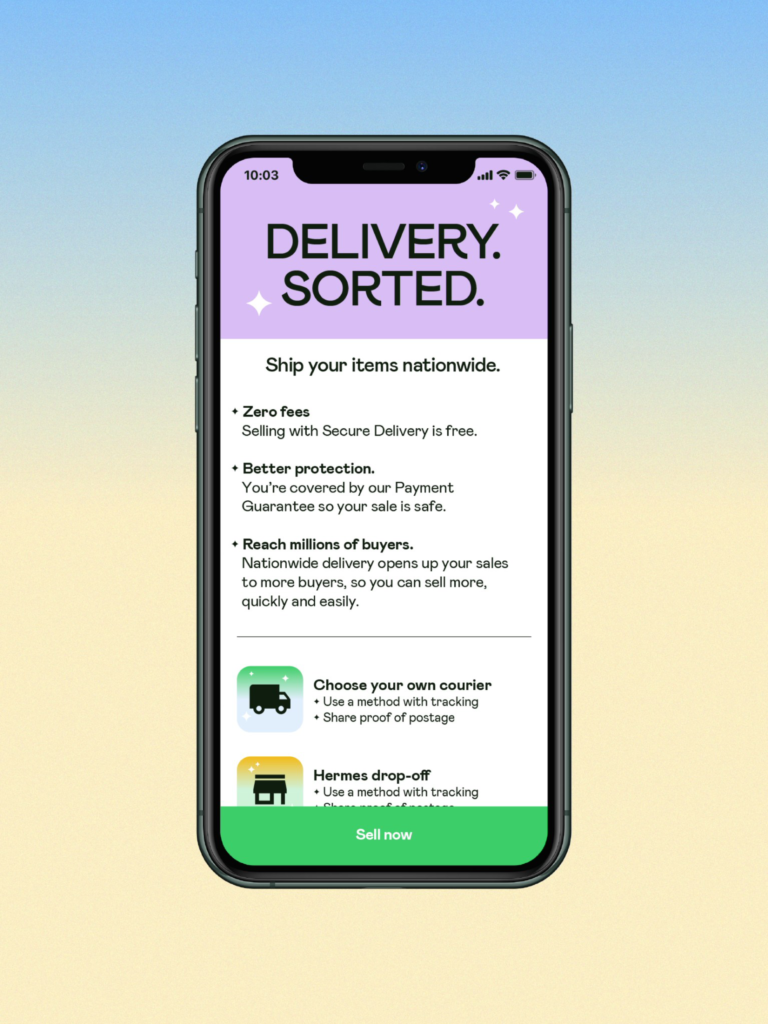
Shpock is a local marketplace app. Downloaded more than 50 million times across Europe, it’s the place to come to find great deals or get a great price. To build on its success, Shpock was breaking out of the neighbourhood to offer nationwide transactions. While focusing on tech and fashion items, and introducing more safety features such as buyer protection, secure delivery and in-app payments.
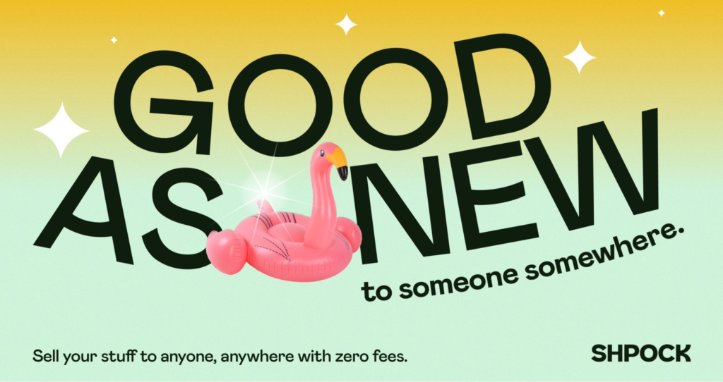
The Joy of Selling.
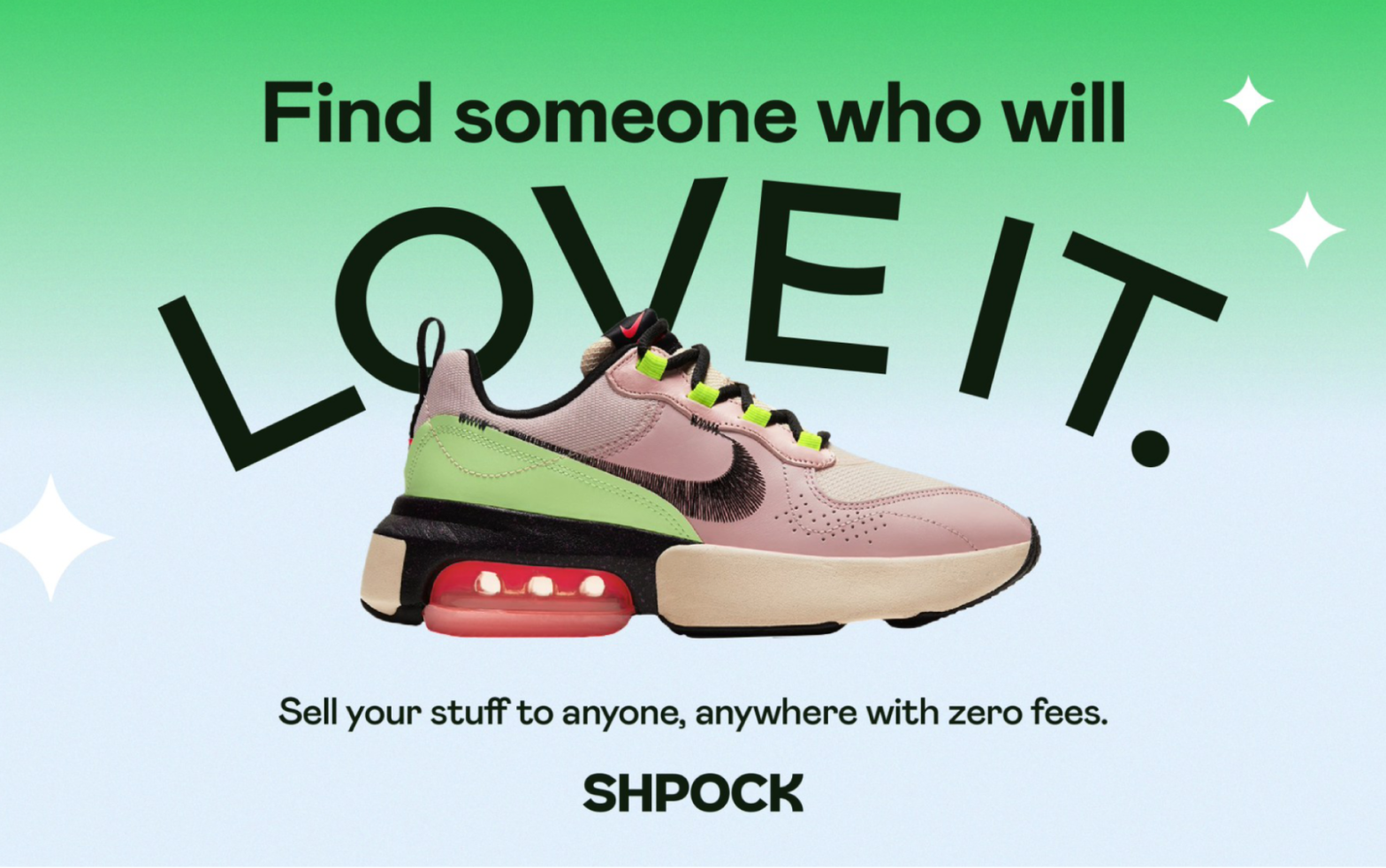
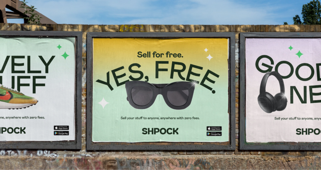
To bring to life Shpock’s ambition of making selling anything and everything super effortless and easy, I articulated the brand idea and tagline — ‘The Joy of Selling’. This was the creative springboard for the new brand and following UK campaign.
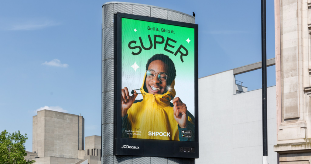
Building on the positive energy of the brand strategy, I then defined a verbal identity that bottles Shpock’s internal playful spirit, bringing an enthusiastic tone to every communication.
Sharing that ‘sold-it’ feeling.
The strategic articulation of ‘The Joy of Selling’ also inspired the visual system. From the Shparkle to the expressive art direction and bespoke typeface with ‘smiling’ glyphs.
Ready for the future.
“With our all-new look, we can communicate what makes Shpock so special. From our bold new font to the fun and playful Shparkle, our new brand will bring a smile to new and existing users as they experience the joy of selling.”
Esteve Jané — Shpock CEO